Where'd my UX go?

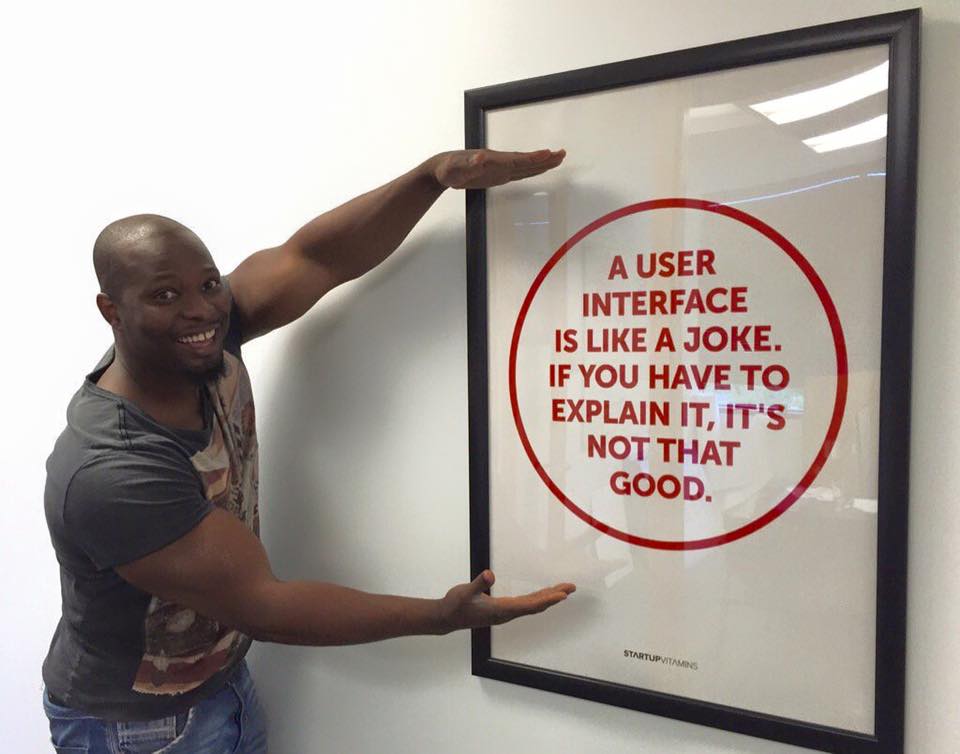
Disclaimer: I am not the happy looking chap in the photo. Original I was working on a personal project recently when a realization dawned on me. User Experience Design,also known as UX design, and software design collide more frequently. And not only in the User Interface layer. Before I get too far, when I talk about UX, I am referring to the experience the user has while attempting to use the device or object, or code. I think this image does an excellent job of describing good UX concisely.
It’s pretty easy to tell what UX is like with a Graphic User interface, or a GUI. After all, this is the part everyone touches. If a website is snappy and the layout makes sense, that is good UX. If it is clear how to do the operation you want, without needing to consult the magic talking paperclip, then it is a good UX. But it seems that once you go below the GUI layer, the lessons on good UX vanish.
I was working on a Fluent Testing API for python when I realized it. In version 1, I had all the functionality for this API bound up in a single class. Sure, it limited the import tree, and made it easy for me to develop. For version 2, I decided to pull the functions into separate classes. And while I was writing out some example cases, I realized that this simple code change resulted in an augmented User Experience!
You see, by pulling the various functions into different classes, I allowed the IDE to create better prompts. The better prompts now guide a user of my API through the proper pattern of using my API. Since there were fewer functions to choose from, it is now clearer how to proceed. The user no longer has to consult a lot of documentation.
This is a simple example, but it did get me thinking. In fact, one week prior, I added a Facade to one of my library at work. The Facade simplified interactions with my library. Now other software engineers could more readily use my library’s functionality. I am surprised that I didn’t think of it at the time, but APIs are a Software Engineer’s UI layer. As a result, they should be subject to a UX review!
I mentioned earlier that I have noticed that, on the whole, UX degrades as you leave the GUI layer. Two factors are responsible, in my opinion. First, the majority of UX review and work goes into the GUI layer. And this focus makes sense. The vast majority of software interaction is through such a layer. As an aside, finding a UX guy who can talk about UX and about API design can be difficult. I usually have a heck of a time getting time with them to review a GUI design with them!
The Second factor is a lack of discipline. I am not throwing stones here, the first version of my Testing API is example of such a lack! I collected all the functionality in a single class because it was easier for me! I wanted to get the functionality together and to reduce the import tree.
In hindsight this is a silly reason. And yet, it was enough to change my behavior. So now that I’ve seen the problem, what can I do? Well, I noticed the improvements made in the UX for version 2 by writing up some examples. That is to say, I used it. This is a good start, by submitting it to user testing would be a better step.
After all, as the design I was intimately familiar with the inner workings and the proper usage of the tool. But a fresh user wouldn’t be. And if there is anything I have learned developing software: the user never does exactly what you expect them to. Besides more user testing, some cross-functional education might help. This recent epiphany put me in mind of a tech talk that I hadn’t finished. You can find the youtube video here. I am hoping that revisiting the principles from the talk will continue to improve my designs!
